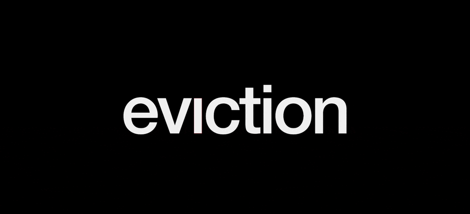
eviction
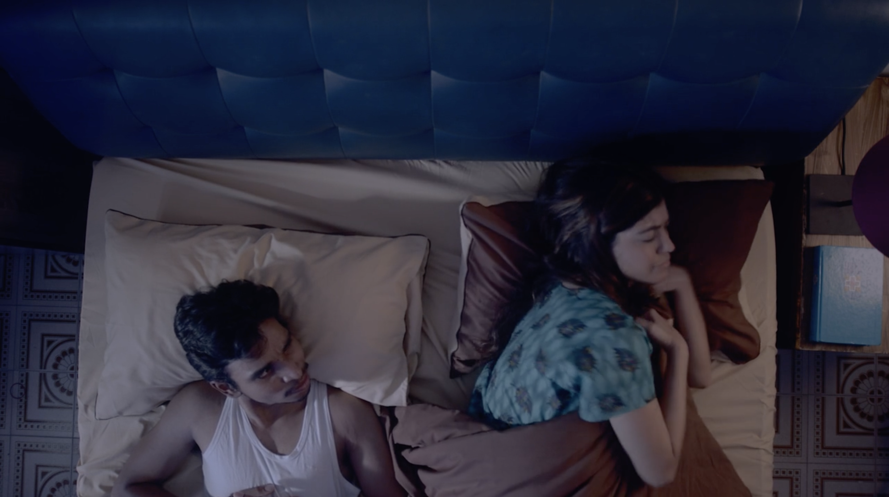
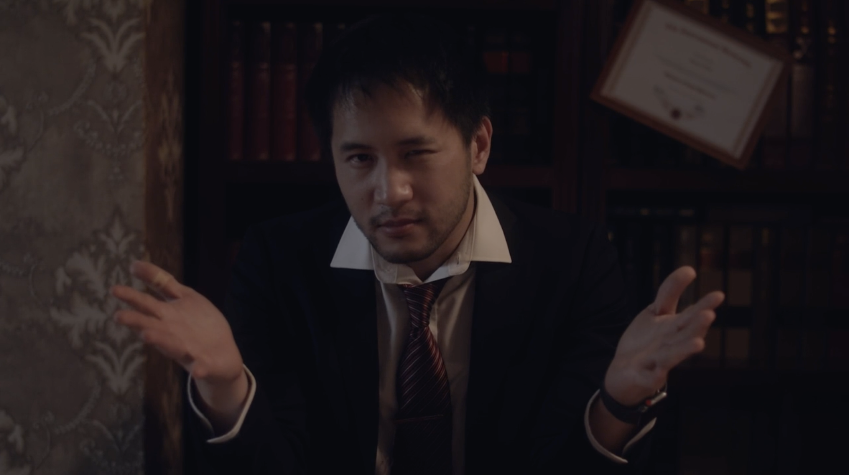
This project highlights the story of a son’s estranged father who has intervened in his life.
The art direction of the short film started off with the selection process of the preferred typeface as a logotype. Akzidenz-Grotesk was chosen due to it’s controversial origin which aligns well with the narrative of the film.
The two main characters are depicted as the two ‘i’ in the word ‘eviction’, while the deletion in one of the tittle portrays the absence of one, in this case, the father of the protagonist.
Additionally, the simple alternating blinks between the two tittles in motion emphasises on the concept of either one or the other, representing the tension of coexistence.
Film